SnackUp revolutionizes the movie theater experience by providing an inclusive snack ordering app that allows you to enjoy your favorite treats without leaving your seat and missing the movie.
My Role
Lead UX Designer/Researcher
Overview
SnackUp serves as a convenient app for ordering and delivering snacks within movie theaters. This eliminates the need for individuals with sizable families, young children, or difficulty reading cinema menus to worry about missing any part of the movie experience!
The Challenge
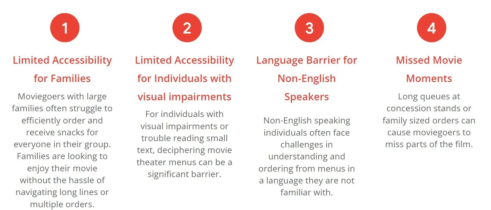
SnackUp addresses the common challenges faced by those with large families, young children, or difficulty reading movie theater menus. By offering a user-friendly ordering and delivery solution, we aim to ensure that everyone can enjoy their movie without missing out on snacks or the show itself.
The Solution
The primary goal of SnackUp is to enhance the movie-going experience by providing a seamless and inclusive way for users to order and receive their favorite snacks during the film. We aspire to make the process of enjoying refreshments as effortless as possible, fostering a more enjoyable and stress-free cinematic outing for all.
User Research: Summary
In crafting our app, we combined primary and secondary research with usability studies for a comprehensive approach. Through surveys and interviews, primary research illuminated user needs, steering our design. Secondary research provided industry insights, aligning our app with market trends. Usability studies then fine-tuned the user experience, ensuring our app was user-centered and effective.
User Research: Pain Points
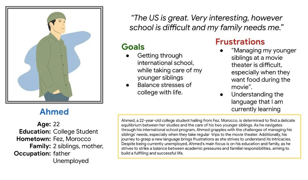
Personas
Meet Tabitha, a working mother and Ahmed, a international student living in the United States. With two completely different lives, both struggling with very similar issues.
User Journey Map
Goal: Order food quickly at the movie theater without missing crucial parts of the film
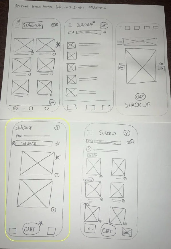
Paper Wireframes
The bottom picture combines elements of the previous paper wireframes, to simplify and create the easiest experience for new “chefs”. Simplifying the page into four videos with recipe info allows the user to quickly choose a dish.
Digital Wireframes
The primary goal of my digital wireframe is to translate the structured flow and visual clarity of the accessibility features.
The concept is to reassure users that they can access the profile page without the sensation of losing progress on the initial page.
Low-Fidelity Prototype
The sequence initiates from the home page, concluding at the order confirmed page, supplemented by secondary flows beneath the primary flow.
Check the flow out here.
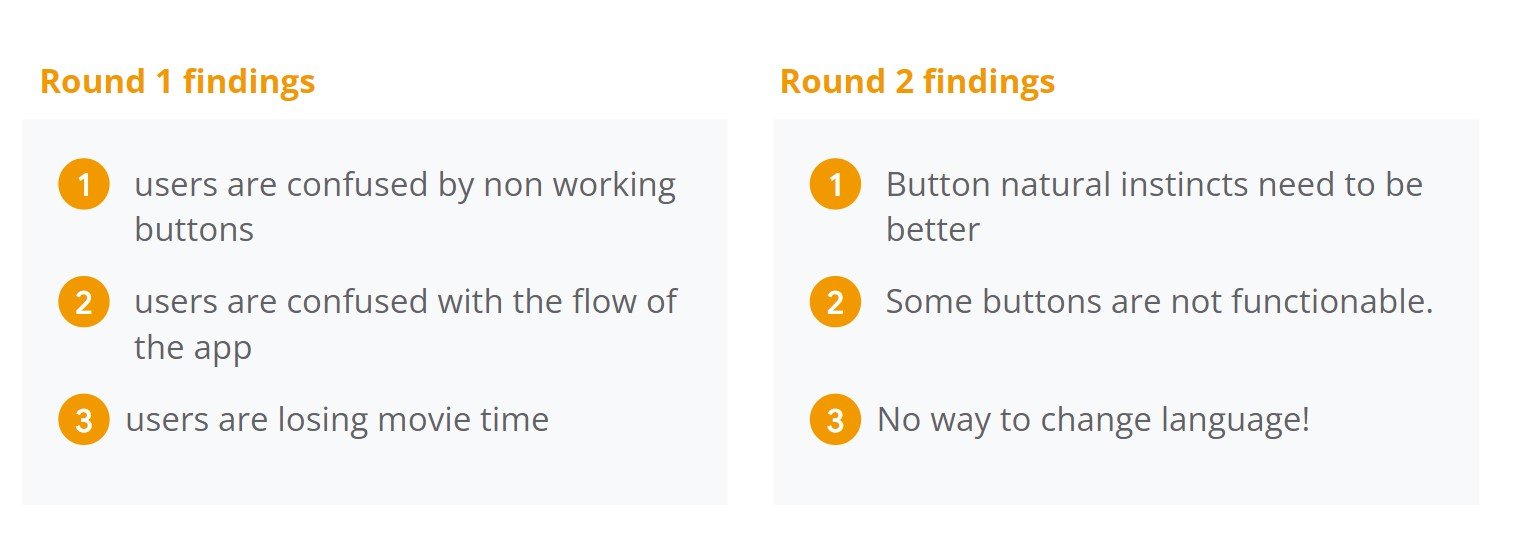
Usability Study Findings
Mockups
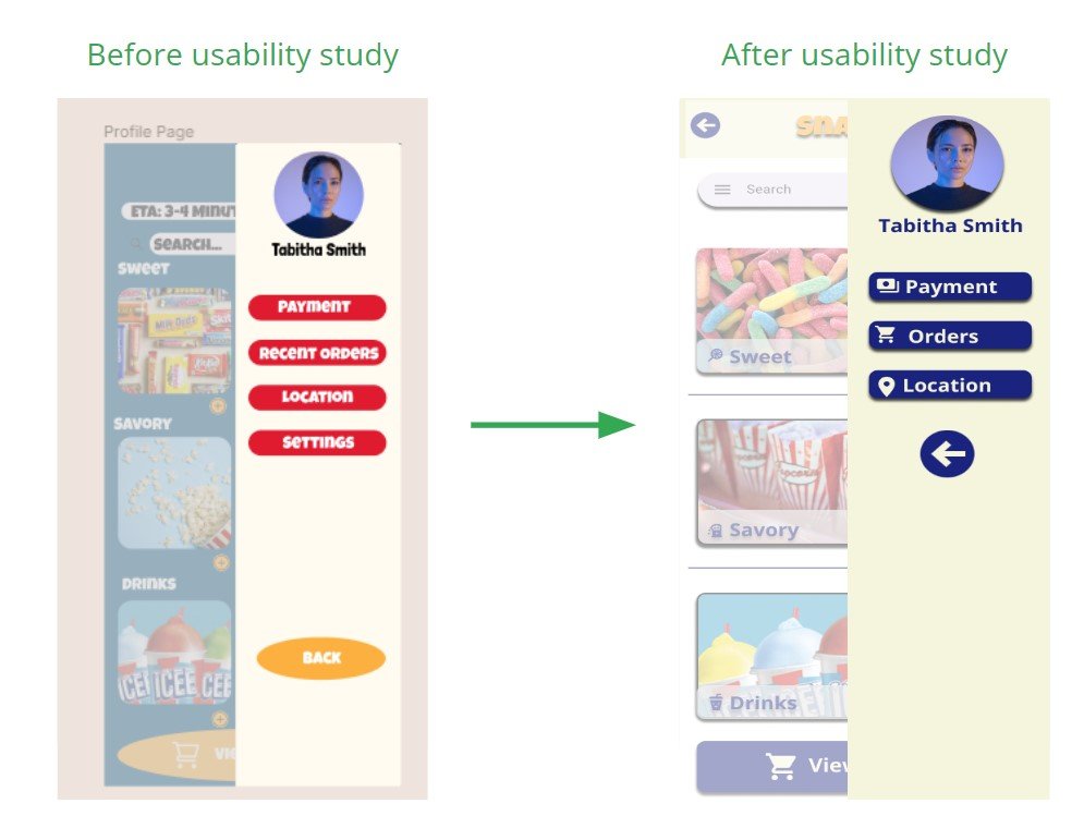
The initial mockups exhibited a conflicting color scheme and inconsistent shapes, lacking accessibility icons. We revamped the color palette for neutrality, enhanced readability, and adopted a more accessible font choice.
Accessibility Considerations
Takeaways
Next Steps
